When it comes to whipping up user interfaces in no time, Tailwind UI stands out as one of the best tools in the game. Built on top of Tailwind CSS, this component library has totally flipped the script on how developers go about styling their web applications. It’s all about speed, efficiency, and some pretty snazzy designs.
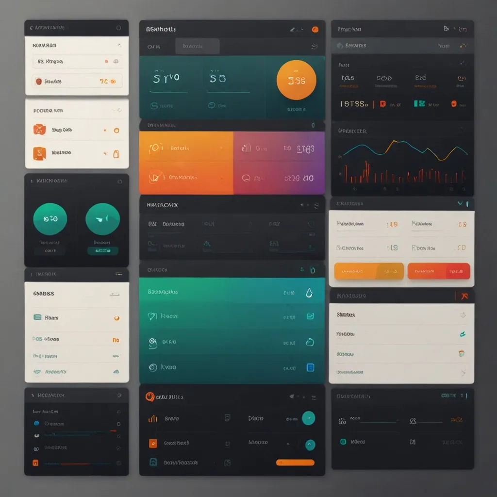
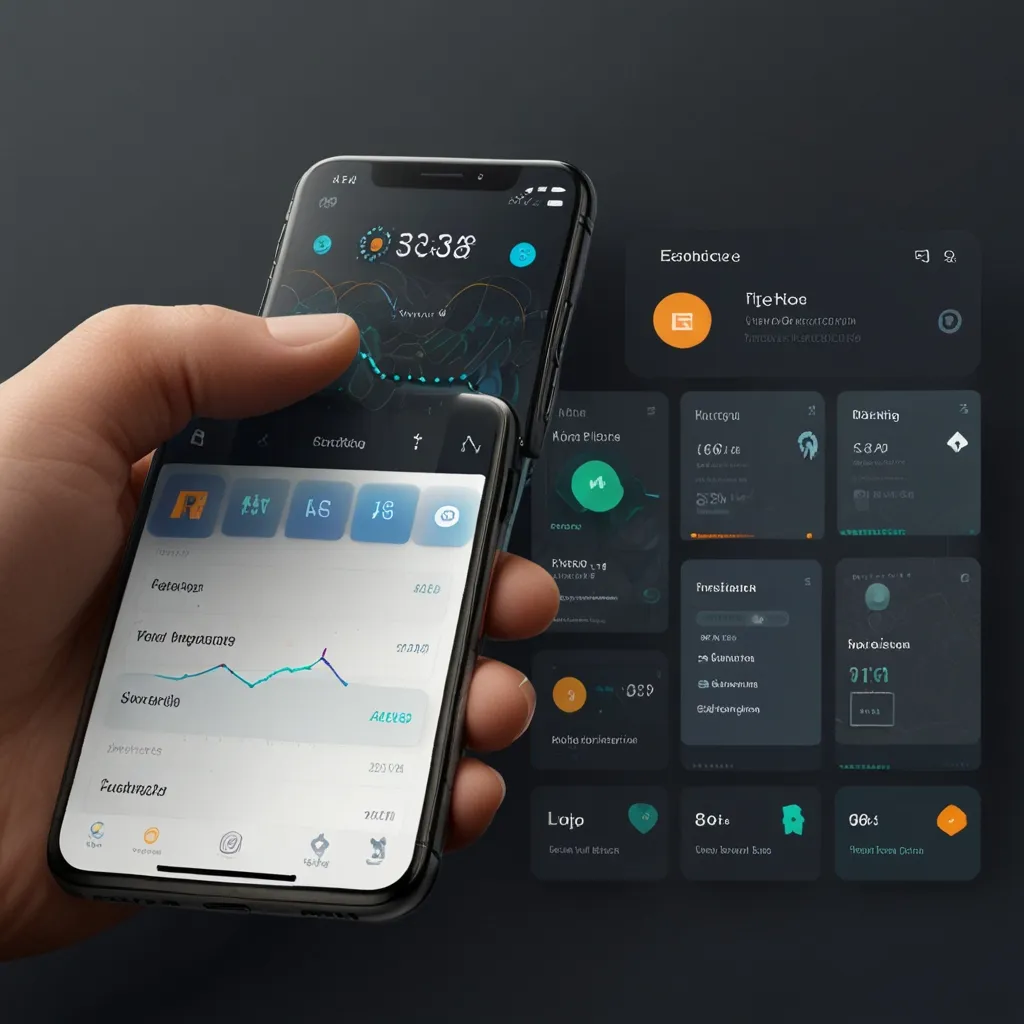
Imagine having a treasure trove of beautifully designed UI components and templates at your fingertips. That’s what Tailwind UI offers. Whether you need a simple landing page or a complex web app, this collection of over 500 components gets you off to a flying start. Think form layouts, tables, modals, navigation menus – you name it, they’ve got it. All these components are professional-grade and ready to drop into your projects.
So, why is Tailwind UI such a game-changer, you ask? Well, it’s all about creating sleek and consistent user interfaces without a headache. Unlike other high-level component libraries that give you pre-built markup and interactivity, Tailwind UI hands you the raw, source code. This way, you can build right out of the box but still have the freedom to tweak things to your heart’s content. It’s the best of both worlds: rapid development and full customization.
Picture this: You’re working on a web app that needs lots of interactivity. Normally, you’d reach for something like MaterialUI or Ant Design, right? But if you’re after a custom look, Tailwind UI comes out on top. It helps you develop faster with less bulky CSS, making your app more performant. And because Tailwind CSS uses this neat mini-language for styling, you can generate most of your CSS from a consistent configuration. Talk about a time-saver!
Tailwind UI isn’t just about individual components either. They offer production-ready website templates built with React and Next.js. These aren’t your run-of-the-mill templates; they’re visually stunning and super customizable. They’re perfect for anyone wanting to peek under the hood and see how the pros build real websites using Tailwind CSS. For instance, if you’re putting together a SaaS marketing site, they’ve got templates with hero sections, feature sections, testimonials, and more. All of them look sleek and are functional to boot.
Customization is a breeze with Tailwind UI. While you get these awesome pre-designed components, you’re not stuck with them as-is. Tailwind UI lets you tweak everything extensively to fit your unique design needs. If you’re combining it with DaisyUI or HeadlessUI, you can apply minimal tweaks but still get lots of mileage out of these components. This way, you maintain a consistent design without the hassle of more convoluted component libraries.
Tailwind UI has completely streamlined development workflows for many. But, it can be a bit of a curveball for design teams working with tools like Figma. Designers often start from scratch, creating UI elements and layouts without an existing component library that matches Tailwind UI. This can cause a bit of a disconnect between design and development, eating up time to align everything.
To bridge this gap, some teams are building their own Figma component libraries that mirror those in Tailwind UI. This approach ensures that designers and developers are on the same page, working with the same components, and cutting down on modification time.
The community behind Tailwind UI is pretty fantastic too. Loads of developers contribute to its growth, suggesting and implementing improvements. Take, for example, the suggestion to document layout variations at the top of each component file. It’s a small touch but makes it way easier to understand supported screen sizes and layouts. Some have even asked for versions of the components that explain what each section does, making it simpler to create JavaScript components. This kind of community engagement keeps Tailwind UI powerful and very user-friendly.
In real-world scenarios, Tailwind UI is nothing short of a game-changer. If you’re putting together a podcast website, you can pick a template that gives you everything from a hero section to testimonials. It saves you a ton of time and ensures your site looks polished and professional.
Same goes if you’re writing documentation. Tailwind UI can help you craft a visually appealing, easy-to-navigate interface without stressing over the design. This is super handy for tasks that already take ages, like writing documentation.
Tailwind UI is a powerhouse for any developer aiming to create beautiful and consistent user interfaces in no time. With its rich library of components, ready-to-go templates, and strong community backing, it’s a go-to for projects of all sizes. Whether you’re a seasoned dev or just starting out, Tailwind UI offers the flexibility and options you need to create top-tier web applications.
So next time you’re diving into a new project, think about leveraging Tailwind UI. It’s all about making your development process smoother and achieving pro-level results without the fuss.


