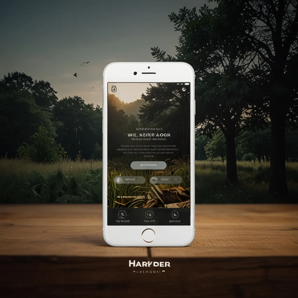
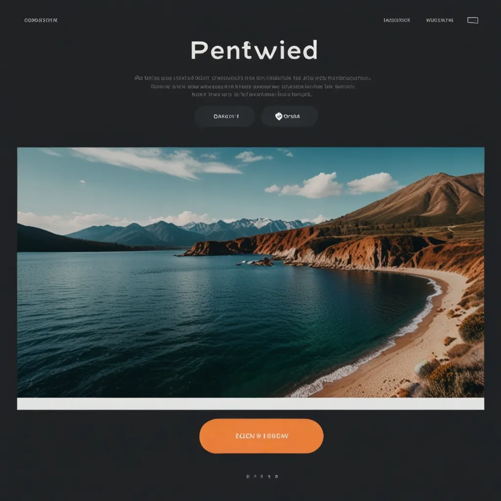
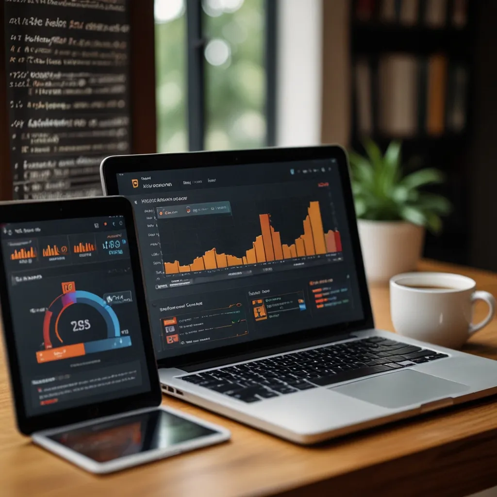
Parallax scrolling has been captivating web users for years now. It’s one of those cool design techniques that give websites a sense of depth and immersion. Basically, when you scroll, background images move slower than the stuff in the foreground. This creates a neat illusion of 3D space—foreground elements appear closer, and the background looks further away. It’s like a magic trick for your eyeballs.
Think of it like old-school animation techniques. Animators used something called a multiplane camera method to make scenes look deeper, by shifting different layers at various speeds. Parallax scrolling does the same thing but on a website. You might be scrolling through a page, and the background images seem to lag, while the text and pictures in front zip by, creating a faux-3D effect that pulls you into the page.
What’s super cool about parallax scrolling isn’t just how it looks, but how it makes you feel. It’s incredibly engaging. Websites can turn into an interactive experience, inviting users to keep scrolling and discover more visual delights and storytelling elements. You could be scrolling down a page about the history of the web, and each flick of your finger unveils another dynamic illustration or graphic, making the history lesson more captivating.
From a business standpoint, parallax scrolling is a fantastic way to stand out. It gives a unique and visually appealing look to your website, helping you distinguish your product or service in a competitive market. Let’s say a tech giant like Apple decides to use parallax scrolling for an iPad Pro page. They might guide you horizontally through the specs and features of the device, giving you a slick, engaging way to explore it. It’s like the website is showing off how advanced and capable the business is through its design choices.
There are some top-notch examples out there. Take Koox, a restaurant that uses parallax scrolling to weave an interactive story about their food, the place, and the chefs. This isn’t just a gimmick on the home page; it extends to their menu too. When you look at the dishes, parallax scrolling spices things up, highlighting the variety and deliciousness of their offerings.
Another example? Check out the PORSCHEvolution site. It narrates the evolution of Porsche cars over the decades with sleek parallax scrolling. Add a soundtrack to the mix, and the experience becomes even more immersive.
Of course, nothing’s perfect. Parallax scrolling can have its downsides. For people with vestibular disorders, too much movement can cause dizziness or disorientation. That’s why it’s essential to use these effects sparingly. Keep movement effects limited to smaller areas, and be considerate by providing options to turn off the parallax effects if needed.
Also, before going all-in with parallax scrolling, think about the impact on your site’s performance. Large image files can slow down loading times, making for a clunky user experience. Compressing images is vital to keep things smooth and speedy.
Want to create parallax scrolling effects? It’s not rocket science. Using CSS, you can set up background images to stay still while other elements move. If you’re not a web design whiz, don’t worry—there are pre-designed templates that include these effects, making it easier to spice up your site.
When using parallax scrolling, less is often more. Apply it selectively to headers, titles, or just on the home page. This way, you enhance your site’s design without overwhelming users. Play around with colors too—using more muted tones in the background and vibrant ones in the foreground can heighten the sense of depth.
Parallax scrolling isn’t just for making your site look pretty. It can also serve practical purposes. For instance, it can guide users through a story or present information engagingly. Take the “Defeat B.O.C.O.” project by Fresh Consulting. They use horizontal parallax scrolling, combining vertical and horizontal slides to create an engaging journey for users.
In short, parallax scrolling is a nifty design technique that adds depth, engagement, and visual flair to a website. When used wisely, it not only enhances user interaction and boosts aesthetic appeal but also supports marketing and branding efforts. By grasping its benefits and understanding its considerations, designers can craft memorable and engaging web experiences that leave users wanting more.


