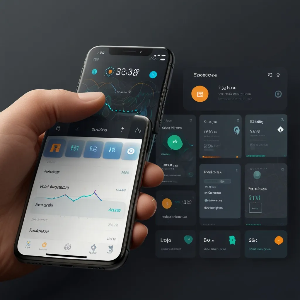
Let’s dive right into the world of motion UI (user interface) and see how it spices up the digital landscape. In today’s fast-evolving world of design, motion UI isn’t just a flashy add-on; it’s a core component that engages users and makes interactions smoother and more intuitive.
Grabbing and Keeping Attention
The dynamic nature of motion UI grabs user attention in ways that static design just can’t compete with. Instead of a dull, unchanging interface, motion graphics pull users in and keep them glued. Imagine scrolling through Instagram and coming across those animated Stories. You can’t help but swipe through, can you? That’s because those animations are designed to catch the eye and keep you coming back for more.
Helping You Navigate
Not only does motion UI captivate you, but it also helps you understand hierarchy in the interface. When designers use animation strategically, they highlight essential elements and guide you effortlessly through complex tasks. Take Apple Music as an example. Notice how the play button and volume slider seem more prominent through subtle animations. It’s all designed to make navigation a breeze.
Smooth Transitions and Feedback
There’s nothing quite like a smooth transition to make an app feel natural. When you use an app like Tinder, the swipe animation isn’t just there for show. It provides clear feedback—a card sliding off the screen lets you know your action was registered. This kind of motion makes the app more intuitive and enjoyable to use.
Telling a Story
Ever watched a Netflix trailer that felt almost like a mini-movie? That’s motion UI at work, enhancing storytelling by animating characters and scenes. It’s not just about putting content on the screen; it’s about making that content come alive. The animated transitions and trailers make the whole viewing experience more immersive and memorable.
Tiny but Mighty: Microinteractions
Microinteractions might be small, but they pack a punch. These tiny animations—like the heart animation when you “like” a post on social media—add a personal touch to the digital experience. They create moments of delight that keep you coming back and make the entire experience more enjoyable.
Purposeful Animations
The trick to effective motion UI is purpose. Random animations can overwhelm or confuse users. But when animations are thoughtful and purposeful, they enhance functionality. Imagine pressing a button and seeing an animation that confirms your input. It removes any uncertainty and makes the interface easier to use.
Consistency and Accessibility
Consistency is key. When animations are uniform across an app or website, users find the experience more coherent and comfortable. Plus, it’s important to consider those who might be sensitive to motion. Providing options to reduce or remove animations ensures that the design is friendly to everyone.
Clear Feedback and Guidance
Motion can also provide clear feedback and help guide users. Let’s say you tap a hamburger icon and the navigation menu slides over the page. You instantly know that your action was recognized. This makes for a more effective, intuitive interaction because our eyes are naturally drawn to motion.
Signifying User Actions
Animations can clarify what actions are possible. A card that expands from the bottom to the top of the screen signals that you can close it by pulling down. This directional motion guides users intuitively, making the interface feel more natural.
Creating Emotional Connections
Used judiciously, motion UI can build an emotional connection between the user and the product. Subtle animations can create a sense of joy or satisfaction, making users more loyal and attached to the product. But it’s a double-edged sword; overdoing it can annoy or distract, so balance is crucial.
Best Practices in Motion UI
The best results come from animations that serve a specific purpose. They shouldn’t just be there to look pretty. Regularly testing these animations helps identify areas for improvement. And remember, different platforms have different needs. What works on a desktop might not work on mobile, so tailor your animations accordingly.
Early Integration and Continuous Validation
Bring motion UI into the design process early on. This helps spot usability issues right from the get-go. Experiment with different styles and speeds to see what fits best. Watching actual user interactions can reveal what works and what doesn’t, allowing for continuous refinement.
Staying Updated
Like any other tech, motion UI is constantly evolving. Keeping up with the latest trends and tools can spark new ideas and possibilities. Airbnb’s Lottie project, for instance, offers a flexible solution that’s become popular for developing animations in digital products. It’s tools like these that keep the field exciting and innovative.
Concluding Thoughts
Motion UI is a game-changer. It turns ordinary user interactions into engaging, intuitive experiences. Whether it’s enhancing storytelling, providing clear feedback, or creating emotional connections, the power of motion UI is undeniable. The key is balance—animations should enhance, not detract, from the user’s journey. So the next time you’re designing or even just browsing, pay attention to those little animations. They’re not just eye candy; they’re what make the digital world go round.


